Overview
The Lorem Ipsum Generator creates placeholder text for your designs, mockups, and prototypes. Whether you need classic Latin-style text or themed variations like pirate speak or coding jargon, this tool has you covered with 6 generation modes and 8 unique styles.
Interface overview
The Lorem Ipsum Generator has an intuitive layout with all options visible at a glance. Here's what you'll find:
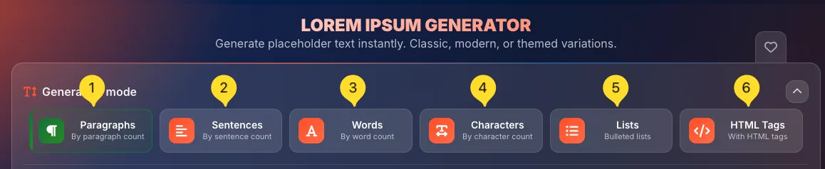
Generation mode selector (top)
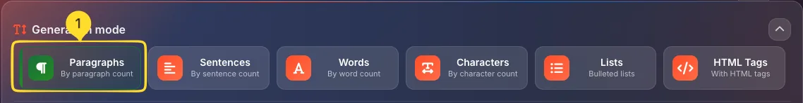
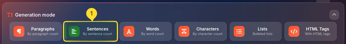
At the very top, you'll see 6 mode buttons:
• Paragraphs (paragraph icon) - By paragraph count
• Sentences (horizontal lines icon) - By sentence count
• Words (A icon) - By word count
• Characters (character icon) - By character count
• Lists (bullet list icon) - Bulleted lists
• HTML Tags (code icon) - With HTML tags
Click any button to switch modes. The active mode shows with a colored border/background. You can collapse this section using the arrow icon on the right.
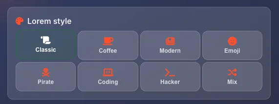
Lorem style selector
Below the mode selector, you'll find the Lorem style panel with 8 themed style buttons arranged in two rows:
• Row 1: Classic, Coffee, Modern, Emoji
• Row 2: Pirate, Coding, Hacker, Mix
Each style generates text with a different flavor and vocabulary.
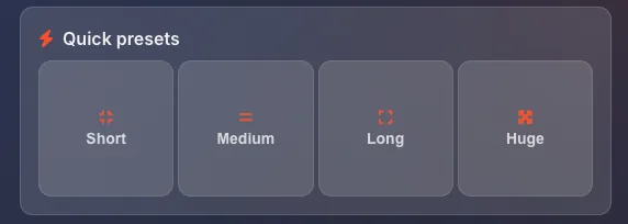
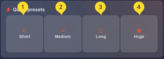
Quick presets
On the right side of the style panel, you'll find Quick presets: four buttons for instant text generation:
• Short: generates a small amount of text
• Medium: generates a moderate amount
• Long: generates more substantial text
• Huge: generates a large block of text
Click any preset to instantly generate text with pre-configured settings.
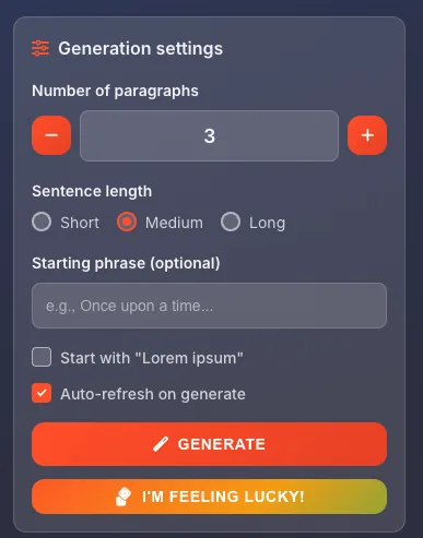
Generation settings panel (left)
The left side contains the Generation settings panel with:
• Number of paragraphs: use -/+ buttons or type directly
• Sentence length: Short, Medium, Long radio buttons
• Starting phrase (optional): custom text to begin with
• Start with "Lorem ipsum": checkbox to ensure classic opening
• Auto-refresh on generate: checkbox for automatic regeneration
• GENERATE button (orange) - creates your text
• I'M FEELING LUCKY! button (rainbow) - random style and settings
Generated text panel (right)
The right side shows the Generated text output. Three action buttons appear in the top right:
• Copy (clipboard icon) - copy text to clipboard
• Download (download icon) - opens export modal
• Clear (trash icon) - clears generated text
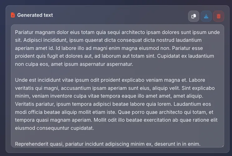
Statistics bar (bottom)
At the bottom of the generated text panel, a statistics bar shows:
• PARAGRAPHS: number of paragraphs generated
• WORDS: total word count
• CHARACTERS: total character count
• STYLE: current style badge (e.g., Classic)

Favorites (top right)
In the top right corner, the heart icon lets you add this tool to your favorites for quick access from the homepage.

Generation modes
The Lorem Ipsum Generator offers 6 different ways to generate text, each designed for specific use cases. Understanding these modes helps you get exactly the amount of text you need.
Paragraphs mode Default
Paragraphs mode generates complete paragraphs of text. This is the default mode and most commonly used for layout mockups.
Select Paragraphs mode
Click the Paragraphs button (paragraph icon) at the top. It shows By paragraph count as the description. This is selected by default when you open the tool.
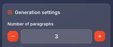
Set the number
In Generation settings, use Number of paragraphs to set how many paragraphs to generate:
• Click - to decrease
• Click + to increase
• Or type the number directly
Each paragraph contains multiple sentences based on your Sentence length setting.
Best for
Use Paragraphs mode when:
• Creating website mockups with body text
• Designing blog post layouts
• Testing typography and line height
• Filling content areas in prototypes
Sentences mode
Sentences mode generates a specific number of individual sentences. Useful when you need precise control over text length.
Select Sentences mode
Click the Sentences button (horizontal lines icon) at the top. It shows By sentence count as the description.
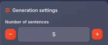
Set the number
The settings panel changes to Number of sentences. Set how many sentences you want - each sentence is complete with proper punctuation.
Best for
Use Sentences mode when:
• Creating short text snippets
• Filling card descriptions
• Testing single-line displays
• Creating tooltip or hint text
Words mode
Words mode generates a specific number of words. Perfect when you have strict character limits or need to test text truncation.
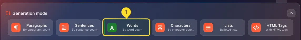
Select Words mode
Click the Words button (A icon) at the top. It shows By word count as the description.
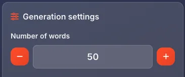
Set the number
The settings panel changes to Number of words. Set your target word count - the generator produces approximately this many words.
Best for
Use Words mode when:
• Testing text overflow behavior
• Creating meta descriptions (150-160 words)
• Filling fixed-width containers
• Social media post mockups with word limits
Characters mode
Characters mode generates text up to a specific character count. Ideal for platforms with strict character limits like Twitter/X.
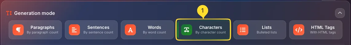
Select Characters mode
Click the Characters button (character icon) at the top. It shows By character count as the description.
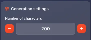
Set the number
The settings panel changes to Number of characters. Set your character limit - the generator produces text that fits within this limit.
Best for
Use Characters mode when:
• Mocking up tweets (280 characters)
• SMS message previews (160 characters)
• Database field testing
• Any strict character-limited UI
Lists mode
Lists mode generates bulleted lists instead of paragraphs. Perfect for feature lists, navigation mockups, or any list-based content.
Select Lists mode
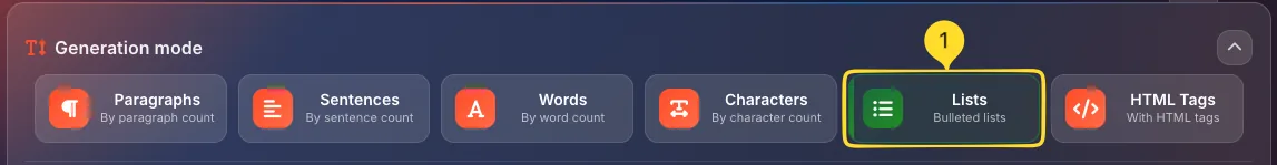
Click the Lists button (bulleted list icon) at the top. It shows Bulleted lists as the description.
Set the number
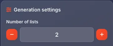
The settings panel changes to Number of list items. Each item is a short phrase or sentence formatted as a bullet point.
Best for
Use Lists mode when:
• Creating feature lists for product pages
• Mocking up navigation menus
• Testing list styling (bullets, spacing)
• Creating specification tables
HTML Tags mode Advanced
HTML Tags mode wraps the generated text in semantic HTML tags. Perfect for testing CMS output or HTML email templates.
Select HTML Tags mode
Click the HTML Tags button (code icon) at the top. It shows With HTML tags as the description.
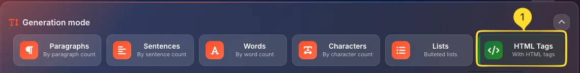
What it generates
The output includes proper HTML structure:
• <p> tags around paragraphs
• <h1>, <h2>, etc. for headings
• <ul> and <li> for lists
• <strong> and <em> for emphasis
This is actual HTML code you can paste into templates.
Best for
Use HTML Tags mode when:
• Testing CMS content rendering
• Creating HTML email templates
• Styling rich text editor output
• Testing blog post formatting
Lorem styles
Beyond the classic Latin placeholder text, the Lorem Ipsum Generator offers 8 unique themed styles. Each style uses different vocabulary and tone while maintaining realistic sentence structures.
Classic style Default
The traditional Lorem Ipsum text derived from Cicero's De Finibus Bonorum et Malorum (45 BC). This is the industry standard for placeholder text.
Select Classic style
Click the Classic button (scroll icon) in the Lorem style panel. This is the default style when you open the tool.
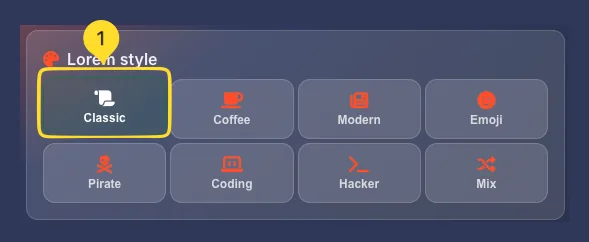
What it generates
Classic style produces Latin-looking text:
"Lorem ipsum dolor sit amet, consectetur adipiscing elit. Sed do eiusmod tempor incididunt ut labore et dolore magna aliqua..."
The text appears Latin but is actually scrambled - it's designed to look realistic without being readable.
Best for
Use Classic style when:
• Presenting to clients (universally recognized)
• Professional design mockups
• Print layouts and typography testing
• Any situation requiring neutral placeholder text
Coffee style
Coffee-themed placeholder text using café and barista terminology. Perfect for coffee shop websites, menus, and food-related mockups.
Select Coffee style
Click the Coffee button (coffee cup icon) in the Lorem style panel.
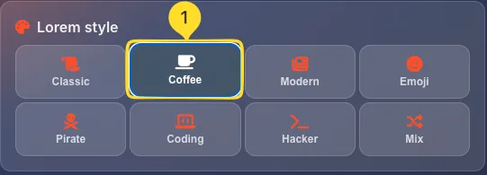
What it generates
Coffee style produces café-themed text with words like:
• Espresso, latte, cappuccino, macchiato
• Barista, roast, beans, brew
• Cream, foam, steamed milk
• Coffee house, café atmosphere
Best for
Use Coffee style when:
• Designing coffee shop websites
• Creating café menus
• Food and beverage mockups
• Restaurant industry presentations
Modern style
Contemporary business and tech-focused placeholder text. Uses modern professional terminology without the Latin feel.
Select Modern style
Click the Modern button (newspaper icon) in the Lorem style panel.
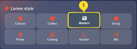
What it generates
Modern style produces business-tech text with words like:
• Innovation, strategy, growth, metrics
• Platform, solution, scalable, agile
• Enterprise, startup, ecosystem
• Digital transformation, synergy
Best for
Use Modern style when:
• SaaS and tech product mockups
• Corporate website designs
• Business presentations
• Startup pitch deck placeholders
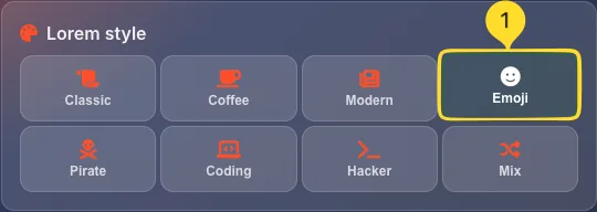
Emoji style Fun
Placeholder text sprinkled with relevant emojis. Adds visual interest and tests how your design handles emoji characters.
Select Emoji style
Click the Emoji button (smiley face icon) in the Lorem style panel.
What it generates
Emoji style produces text interspersed with emojis:
"Amazing features await you. Our platform delivers incredible results. Users love the experience..."
Emojis are contextually placed to match the surrounding words.
Best for
Use Emoji style when:
• Social media mockups
• Mobile app designs
• Testing emoji rendering
• Casual/fun brand mockups
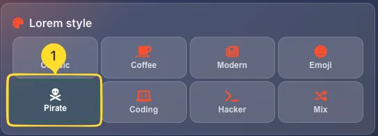
Pirate style Fun
Arr matey! Pirate-themed placeholder text with nautical vocabulary and pirate speak. Perfect for themed projects or adding personality to internal mockups.
Select Pirate style
Click the Pirate button (pirate/skull icon) in the Lorem style panel.
What it generates
Pirate style produces seafaring text with words like:
• Arr, matey, ye, landlubber
• Treasure, doubloons, plunder
• Ship, sail, anchor, deck
• Captain, crew, voyage
Best for
Use Pirate style when:
• Game mockups with pirate themes
• Talk Like a Pirate Day promotions
• Fun internal presentations
• Adding humor to design reviews
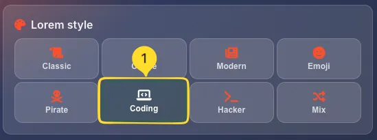
Coding style
Programming and developer-focused placeholder text. Uses software development terminology and coding concepts.
Select Coding style
Click the Coding button (laptop code icon) in the Lorem style panel.
What it generates
Coding style produces developer-themed text with words like:
• Function, variable, array, object
• API, endpoint, database, query
• Debug, compile, deploy, refactor
• Repository, commit, merge, branch
Best for
Use Coding style when:
• Developer tool mockups
• Documentation site designs
• Tech blog layouts
• IDE or code editor UI mockups
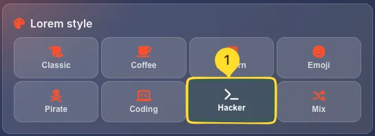
Hacker style Themed
Cyberpunk and hacker-themed placeholder text. Uses cybersecurity and underground tech terminology.
Select Hacker style
Click the Hacker button (terminal icon) in the Lorem style panel.
What it generates
Hacker style produces cyber-themed text with words like:
• Encrypt, decrypt, breach, firewall
• Matrix, node, network, protocol
• Binary, algorithm, neural, cyber
• Access, override, terminal, system
Best for
Use Hacker style when:
• Cybersecurity product mockups
• Tech thriller game designs
• Dark mode UI demonstrations
• Futuristic/sci-fi themed projects
Mix style Random
A random blend of all available styles. Each generation produces text that combines vocabulary from multiple themes.
Select Mix style
Click the Mix button (random icon) in the Lorem style panel.
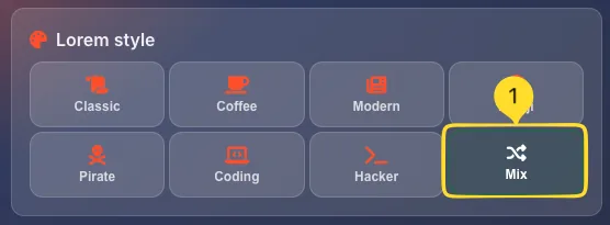
What it generates
Mix style produces varied text that:
• Combines words from all 7 other styles
• Creates unexpected and unique combinations
• Changes with each generation
• Maintains grammatical structure
Best for
Use Mix style when:
• You want variety in placeholder text
• Testing how design handles diverse vocabulary
• Adding unpredictability to mockups
• Just having fun with generation
Quick presets
Quick presets let you generate text with one click using pre-configured settings. Perfect when you need placeholder text fast without tweaking individual options.
Short preset
Click Short (small lines icon) to generate a small amount of text:
• 1-2 paragraphs
• ~50-100 words
• Ideal for: card descriptions, short bios, tooltips
Medium preset
Click Medium (medium lines icon) to generate a moderate amount:
• 3-4 paragraphs
• ~150-250 words
• Ideal for: article excerpts, product descriptions, about sections
Long preset
Click Long (longer lines icon) to generate substantial text:
• 5-7 paragraphs
• ~400-600 words
• Ideal for: blog posts, documentation, long-form content areas
Huge preset
Click Huge (large icon) to generate a large block:
• 10+ paragraphs
• ~1000+ words
• Ideal for: testing scroll behavior, stress-testing layouts, book/article mockups
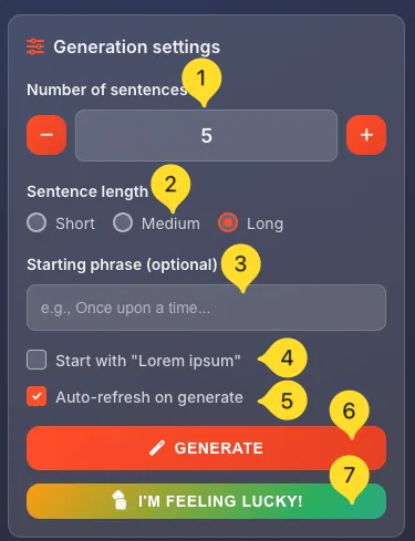
Generation settings
The Generation settings panel gives you fine-grained control over your placeholder text. Here's each option explained:
Number control
The primary number setting changes based on your generation mode:
• Number of paragraphs (Paragraphs mode)
• Number of sentences (Sentences mode)
• Number of words (Words mode)
• Number of characters (Characters mode)
• Number of list items (Lists mode)
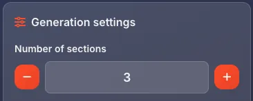
• Number of sections (HTML Tags)
Use - and + buttons or type directly in the field.
Sentence length
Choose how long individual sentences should be:
• Short: concise sentences, 5-10 words each
• Medium: balanced sentences, 10-20 words each (default)
• Long: complex sentences, 20-30+ words each
This affects all modes that generate sentences.
Starting phrase (optional)
Enter custom text in the Starting phrase field (placeholder: "e.g., Once upon a time...") to begin your generated text with specific words.
Examples:
• "Welcome to our website" - for hero sections
• "Product features include" - for feature lists
• "Chapter 1:" - for book mockups
Start with "Lorem ipsum"
Check this box to ensure the generated text always begins with the classic Lorem ipsum dolor sit amet opening.
Useful when:
• Presenting to clients who expect traditional Lorem Ipsum
• Maintaining consistency across multiple generations
• Working with designers familiar with the classic text
Auto-refresh on generate
When checked (default), clicking GENERATE creates completely new text each time.
When unchecked, the generator preserves some elements between generations, useful for iterating on specific content.
GENERATE button
Click the orange GENERATE button to create your placeholder text based on all current settings. The text appears instantly in the Generated text panel.
I'M FEELING LUCKY! button
Click the rainbow I'M FEELING LUCKY! button for a surprise:
• Randomly selects a generation mode
• Randomly picks a Lorem style
• Randomizes settings (amount, length)
• Generates completely unpredictable text
Perfect when you need placeholder text and don't care about specifics.
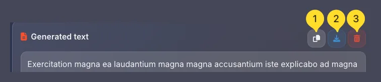
Output & Actions
After generating text, you have several options for using it. The Generated text panel shows your output with action buttons in the top right corner.
Copy to clipboard
Click the Copy button (clipboard icon) to copy all generated text to your clipboard. A notification confirms the copy. Paste directly into your design tool, document, or code editor.
Download/Export
Click the Download button (download icon) to open the Export document modal. This gives you multiple format options and an additional copy button.
Clear text
Click the Clear button (trash icon) to remove all generated text and start fresh. Statistics reset to zero.
Select and copy
You can also manually select portions of the generated text with your mouse, then copy with Ctrl+C (⌘+C on Mac). Useful when you only need part of the output.
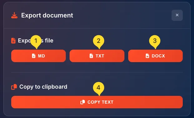
Export options Export modal
The Export document modal provides multiple ways to save your generated text. Click the Download button to open it.
Export as MD (Markdown)
Click the MD button to download as a Markdown file (.md).
• Preserves formatting with Markdown syntax
• Headings become # symbols
• Lists become - bullet points
• Perfect for documentation, GitHub READMEs, or note-taking apps
Export as TXT (Plain text)
Click the TXT button to download as a plain text file (.txt).
• Pure text with no formatting
• Universal compatibility
• Smallest file size
• Works in any text editor
Export as DOCX (Word)
Click the DOCX button to download as a Microsoft Word document (.docx).
• Full formatting preserved
• Opens in Word, Google Docs, LibreOffice
• Ready for professional documents
• Includes paragraphs, headings, lists
COPY TEXT button
The modal also includes a COPY TEXT button at the bottom. This works the same as the copy button in the main interface - copies all text to clipboard.
Close modal
Click the X button in the top right corner to close the Export modal and return to the main interface.
Documentation: MD format
Client deliverables: DOCX format
Universal sharing: TXT format
Statistics bar
The statistics bar at the bottom of the Generated text panel gives you instant metrics about your placeholder text.
PARAGRAPHS counter
Shows the number of paragraphs in your generated text. A paragraph is defined as a block of text separated by line breaks.
WORDS counter
Shows the total word count. Useful for checking if you've hit target lengths for mockups with word limits.
CHARACTERS counter
Shows the total character count including spaces. Essential for character-limited platforms like Twitter/X or SMS.
STYLE badge
Shows the currently selected Lorem style (e.g., Classic, Coffee, Pirate). The badge is color-coded orange to stand out.
Tips for using placeholder text
Frequently asked questions
• Classic uses traditional Latin-like text.
• Coffee uses café/barista vocabulary.
• Modern uses business/tech terms.
• Emoji adds contextual emojis.
• Pirate uses nautical/pirate speak.
• Coding uses programming terminology.
• Hacker uses cybersecurity terms.
• Mix randomly combines all styles.
• Paragraphs for body text areas.
• Sentences for short snippets.
• Words for word-limited content.
• Characters for character-limited platforms (Twitter, SMS).
• Lists for bullet points.
• HTML Tags for CMS or email templates.