Overview
Color Studio is a comprehensive professional toolkit with 5 specialized modes for working with colors. Pick colors visually with harmony suggestions, extract palettes from images, build custom color collections, create CSS gradients with 4 types, and check accessibility contrast. All modes share Color history, Preset manager, and Export features.
Select mode
At the top of the interface, find the Select mode section with 5 mode buttons arranged horizontally. Each mode has an icon, title, and description. The header also contains utility buttons for Color history, Presets, and Favorites.
5 Mode buttons
Choose from 5 specialized modes:
• Color picker: Pick & convert
• Image extractor: Extract from photo
• Palette builder: Build collections
• Gradient generator: CSS gradients
• Contrast checker: WCAG AA/AAA
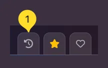
Header buttons
Three utility buttons appear in the top-right:
• History: Opens Color history modal
• Presets: Opens Preset manager modal
• Favorites: Add current color/palette to favorites
Main workspace area
Below the mode selector, the main workspace area displays mode-specific controls and panels. Each mode has a unique interface tailored to its function - color picker shows hue slider and color area, image extractor shows drop zone, palette builder shows color grid, etc.
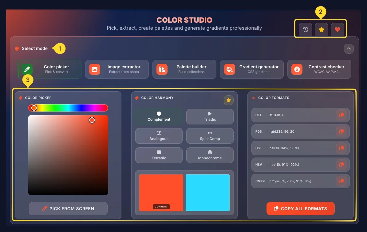
Color picker mode Pick & convert
Color picker mode lets you select any color visually and get its value in 5 formats. It also generates color harmonies based on color theory.
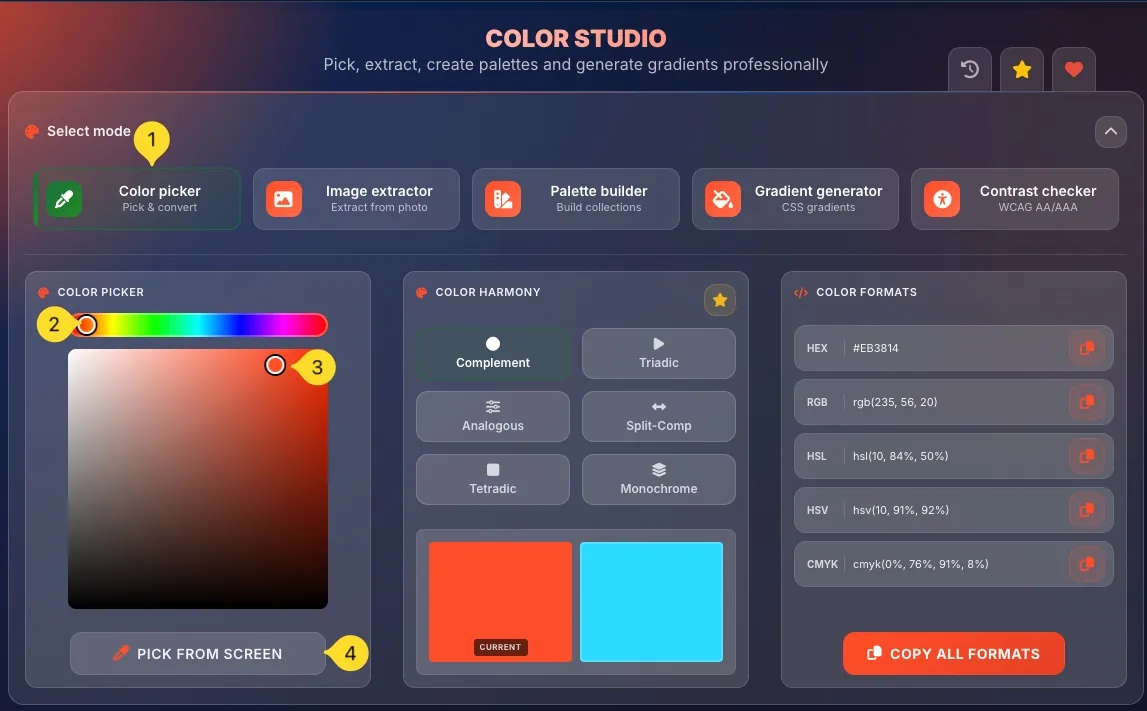
Select Color picker mode
Click the Color picker button (first mode). It has an eyedropper icon and description Pick & convert. The interface shows three panels: COLOR PICKER, COLOR HARMONY, and COLOR FORMATS.
Hue slider
At the top of the COLOR PICKER panel, find the hue slider: a horizontal rainbow gradient strip. Drag the circle handle left/right to select the base hue (red, orange, yellow, green, blue, purple, etc.).
Saturation/Brightness area
Below the hue slider, the large square color area lets you pick saturation and brightness:
• Horizontal (left-right) = Saturation (gray to vivid)
• Vertical (top-bottom) = Brightness (light to dark)
Click anywhere or drag the circle handle to select your color.
PICK FROM SCREEN button
Below the color area, click PICK FROM SCREEN to activate the browser's eyedropper tool. Click anywhere on your screen to sample that color. The selected color appears in the picker.
View selected color
Your selected color appears in the COLOR HARMONY panel as the CURRENT color swatch. The complementary color (opposite on color wheel) shows beside it.
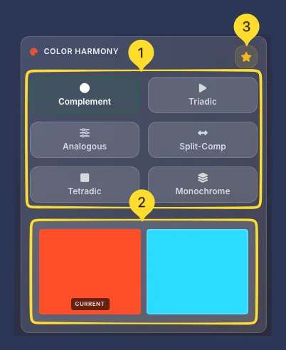
COLOR HARMONY 6 Types
The COLOR HARMONY panel generates mathematically related colors based on color theory. Choose from 6 harmony types to create coordinated color schemes.
Harmony type buttons
Six harmony buttons are arranged in a 2×3 grid. Click any to generate that harmony:
• Complement: Opposite color on wheel (high contrast)
• Triadic: Three colors evenly spaced (balanced, vibrant)
• Analogous: Adjacent colors (harmonious, calm)
• Split-Comp: Base + two colors adjacent to complement
• Tetradic: Four colors (two complementary pairs)
• Monochrome: Shades of one color (unified)
Color preview swatches
Below the harmony buttons, two large color swatches show:
• CURRENT: Your selected base color (left)
• Harmony color - The primary harmony result (right)
For multi-color harmonies (Triadic, Tetradic), additional colors appear in the COLOR FORMATS panel.
Save harmony preset
Click the star button in the COLOR HARMONY header to save the current harmony as a preset. You can access saved presets from the Preset manager.
COLOR FORMATS 5 Formats
The COLOR FORMATS panel displays your selected color in 5 different formats, each with a copy button.
HEX format
Hexadecimal color code (e.g., #EB3814). Most common for web CSS. Click the copy button to copy just the HEX value.
RGB format
Red, Green, Blue values (e.g., rgb(235, 56, 20)). Used in CSS and design tools. Values range 0-255 per channel.
HSL format
Hue, Saturation, Lightness (e.g., hsl(10, 84%, 50%)). Intuitive for adjusting colors - change lightness without affecting hue.
HSV format
Hue, Saturation, Value (e.g., hsv(10, 91%, 92%)). Similar to HSL but uses Value (brightness) instead of Lightness. Common in color pickers.
CMYK format
Cyan, Magenta, Yellow, Key/Black (e.g., cmyk(0%, 76%, 91%, 8%)). Used for print design. Convert here before sending to printers.
COPY ALL FORMATS button
Click COPY ALL FORMATS at the bottom to copy all 5 formats at once. Paste into your documentation or code comments for reference.
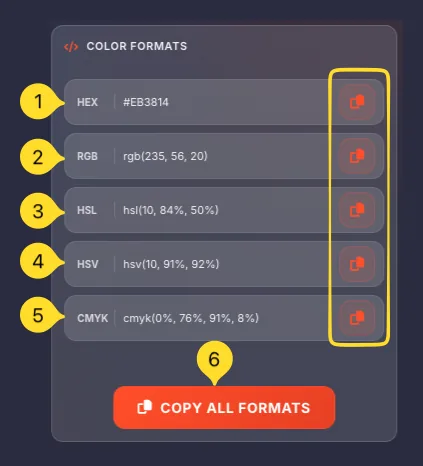
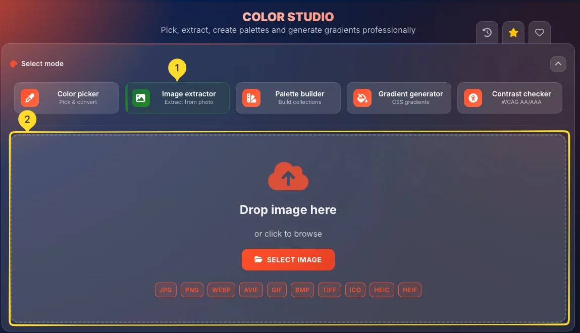
Image extractor mode Extract from photo
Image extractor mode analyzes any image and extracts dominant colors, creating a palette from your photos, designs, or inspiration images.
Select Image extractor mode
Click the Image extractor button (second mode). It has an image icon and description Extract from photo. A drop zone appears for uploading images.
Upload an image
The drop zone shows:
• Cloud upload icon
• Drop image here text
• or click to browse subtitle
• SELECT IMAGE button
Drag and drop an image, or click to open file picker.
Supported formats: JPG, PNG, WEBP, AVIF, GIF, BMP, TIFF, ICO, HEIC, HEIF.
View uploaded image
The UPLOADED IMAGE panel shows your image with circle markers indicating where colors were extracted. Markers are placed at key color points in the image.
Adjust COLOR COUNT
The COLOR COUNT slider (above the image) controls how many colors to extract. Drag to choose 1-10 colors. More colors capture more detail; fewer create simpler palettes.
Configure OPTIONS
Two checkboxes fine-tune extraction:
• Filter extremes: Removes pure black/white from results
• Show points: Displays/hides extraction markers on image
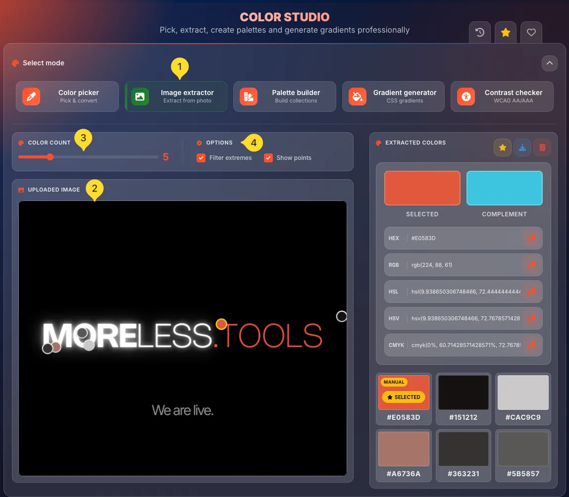
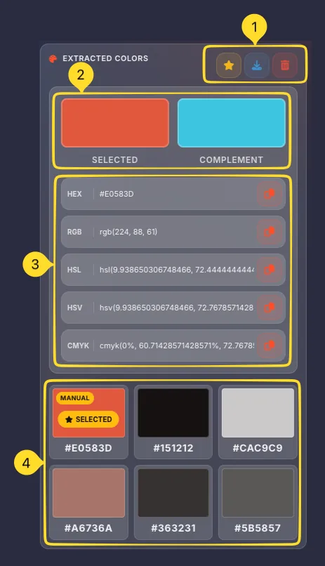
EXTRACTED COLORS Results panel
The EXTRACTED COLORS panel displays all colors found in your image, with full format information and selection features.
Panel header actions
Three buttons in the header:
• Save preset (star) - Save this palette as a preset
• Download: Export colors (opens Export modal)
• Clear (trash) - Clear image and extracted colors
SELECTED and COMPLEMENT
Two large color swatches at the top:
• SELECTED: The currently selected color from the grid
• COMPLEMENT: The complementary color (opposite on wheel)
Click any color in the grid below to select it.
Color format values
Below the swatches, see the selected color in all 5 formats (HEX, RGB, HSL, HSV, CMYK), each with a copy button. These update when you select different colors.
Extracted colors grid
A grid of color swatches shows all extracted colors. Each swatch displays:
• Color preview square
• SELECTED badge on current selection
• HEX code below (e.g., #DC7C6D)
Click any swatch to select it and see its format values.
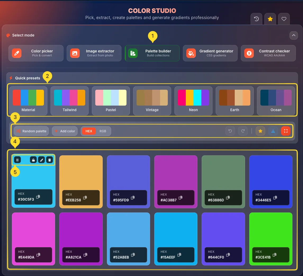
Palette builder mode Build collections
Palette builder mode lets you create custom color collections from scratch or start with professional presets. Build palettes for your brand, website, or design project.
Select Palette builder mode
Click the Palette builder button (third mode). It has a swatches icon and description Build collections. The interface shows Quick presets, action bar, and color cards grid.
Quick presets
The Quick presets section offers 7 professional starting points:
• Material: Google Material Design colors
• Tailwind: Tailwind CSS default palette
• Pastel: Soft, muted tones
• Vintage: Retro, warm colors
• Neon: Bright, vivid colors
• Earth: Natural, organic tones
• Ocean: Cool blue-green tones
Click any preset to load its colors.
Action bar
The action bar contains essential controls:
Left side:
• Random palette: Generate random colors
• Add color: Add a new color to palette
• HEX/RGB toggle: Switch display format
Right side:
• Undo/Redo buttons
• Save preset (star) - Save current palette
• Download: Export colors
• Fullscreen: Enter fullscreen mode
Color cards grid
Colors display as large cards in a grid (6 columns × 2 rows by default). Each card shows:
• Large color swatch
• Format label (HEX or RGB)
• Color value with copy icon (e.g., #30C5F3)
Click the copy icon or color value to copy.
Edit a color
Click any color card to select it. Hover to reveal action buttons:
• Drag handle: Reorder colors by dragging
• Lock: Lock color from random changes
• Color picker: Open picker to change this color
• Delete: Remove this color from palette
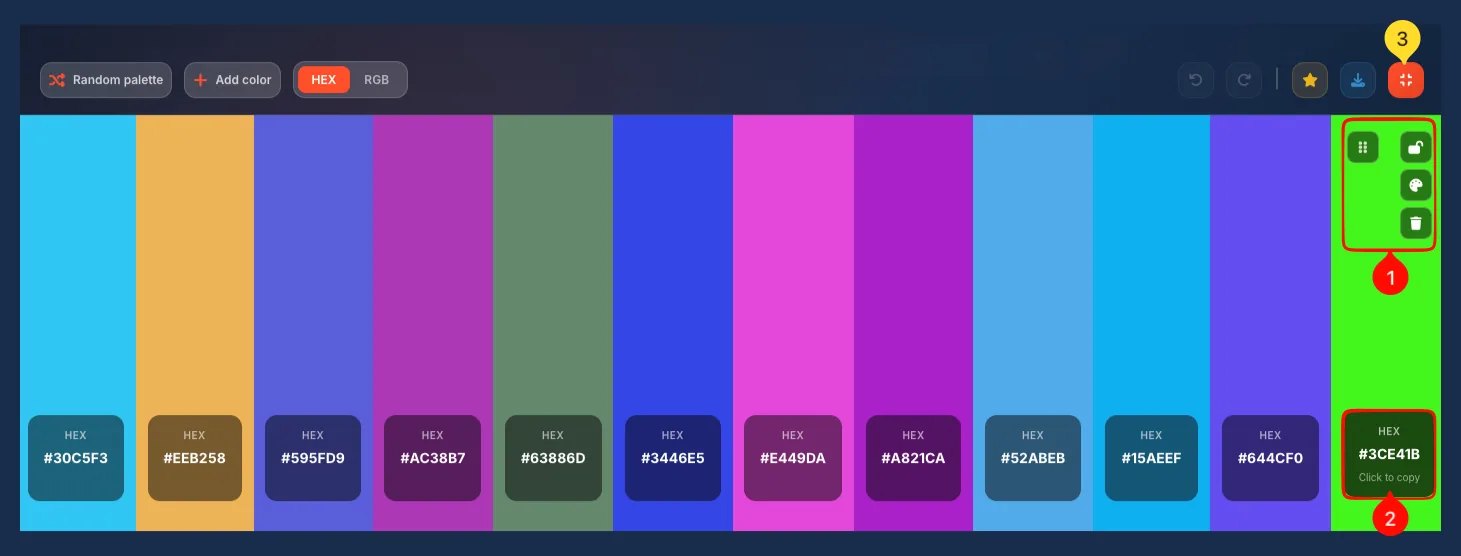
Fullscreen mode Palette builder
Fullscreen mode expands your palette to fill the entire screen, perfect for presentations, client reviews, or detailed color work.
Enter fullscreen
Click the fullscreen button in the Palette builder action bar. The palette expands to fill your browser window.
Fullscreen layout
Colors display as vertical stripes spanning the full screen height. Each stripe is labeled with its HEX code at the bottom. The action bar remains visible at the top.
Per-color actions
Hover over any color stripe to reveal action buttons:
• Drag handle: Reorder by dragging
• Lock: Protect from random changes
• Color picker: Change this color
• Delete: Remove from palette
Click to copy
Click any HEX code label to copy it. A Click to copy tooltip appears on hover. The copied value includes the # prefix.
Exit fullscreen
Click the fullscreen button again or press Escape to return to normal view.
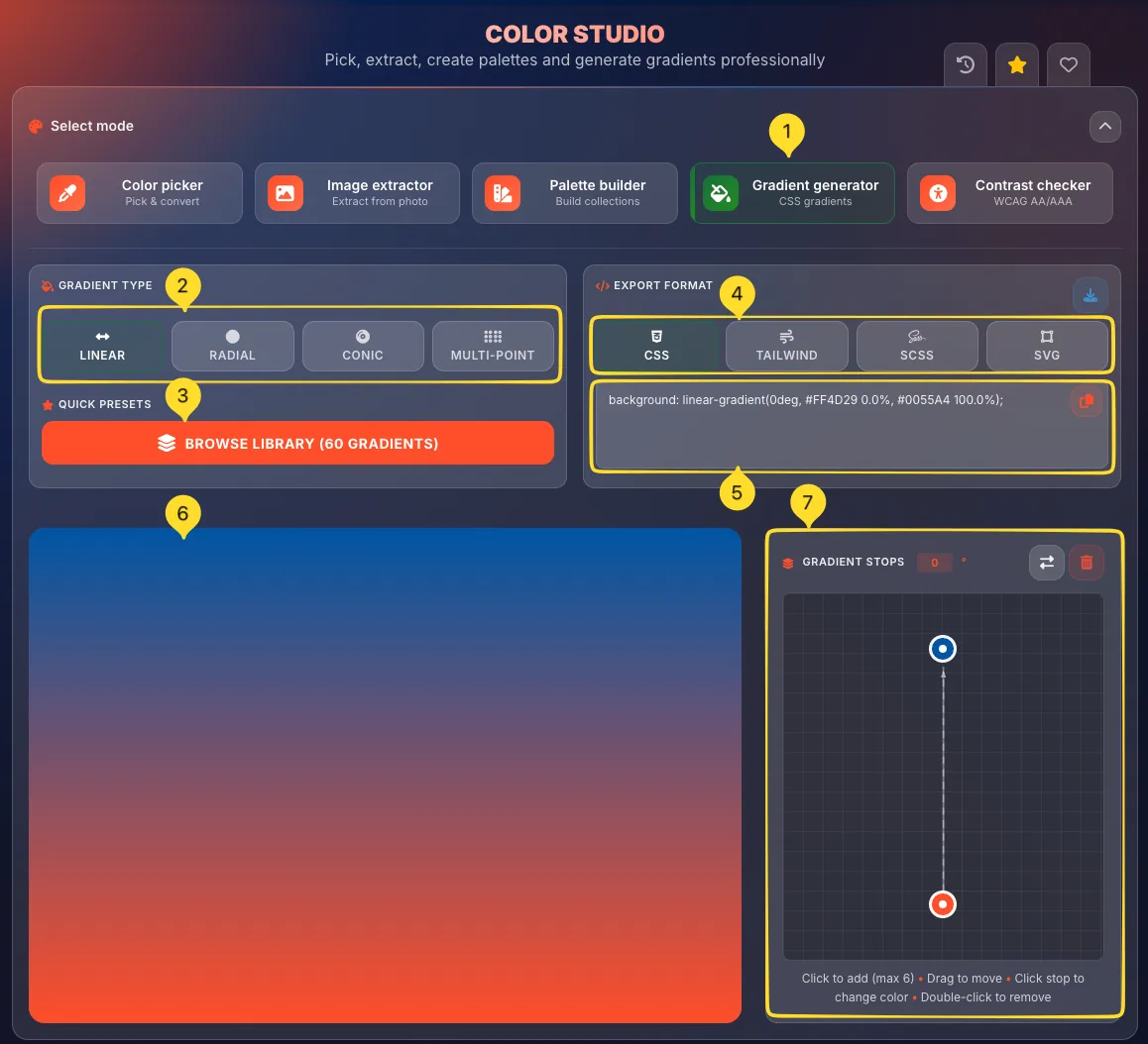
Gradient generator mode CSS gradients
Gradient generator mode creates beautiful CSS gradients with 4 different types. Choose from a library of 60 presets or build custom gradients with visual editors.
Select Gradient generator mode
Click the Gradient generator button (fourth mode). It has a gradient icon and description CSS gradients. The interface shows GRADIENT TYPE, EXPORT FORMAT, gradient preview, and stop editors.
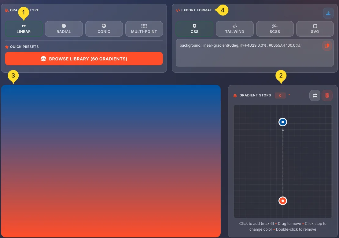
GRADIENT TYPE buttons
Choose from 4 gradient types:
• LINEAR: Straight line transition
• RADIAL: Circular from center point
• CONIC: Sweep around center (like pie chart)
• MULTI-POINT: Multiple overlapping radial gradients
Each type has its own editor panel.
QUICK PRESETS button
Click BROWSE LIBRARY (60 GRADIENTS) to open the gradient library. Browse professional gradient presets organized by style. Click any preset to apply it.
EXPORT FORMAT
Choose your output format:
• CSS: Standard CSS syntax
• TAILWIND: Tailwind CSS classes
• SCSS: SCSS/Sass variables
• SVG: SVG gradient definition
The code preview updates for each format.
Code preview and copy
Below EXPORT FORMAT, the code preview shows the generated gradient code (e.g., background: linear-gradient(0deg, #FF4D29 0.0%, #0055A4 100.0%);).
Click the copy button to copy the code. Click Download to save as a file.
Gradient preview
The large gradient preview panel shows your gradient in real-time. Changes to colors, stops, and settings are reflected immediately.
4 Gradient types Type-specific editors
Each gradient type has specialized controls for its unique properties. The editor panels change based on your selected type.
LINEAR gradient
Creates a straight color transition. GRADIENT STOPS panel shows:
• Vertical line with draggable color stops
• Angle input (0°) - Direction of gradient
• Reverse and Clear buttons
Drag stops to position colors. Click line to add new stops (max 6). Double-click to remove.
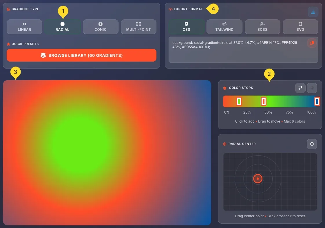
RADIAL gradient
Creates a circular gradient from a center point. Two panels:
COLOR STOPS:
• Horizontal bar with draggable stops (0%-100%)
• Click to add, drag to move (max 6 colors)
RADIAL CENTER:
• Grid with draggable center point
• Crosshair button to reset to center
Drag the center point to offset the gradient origin.
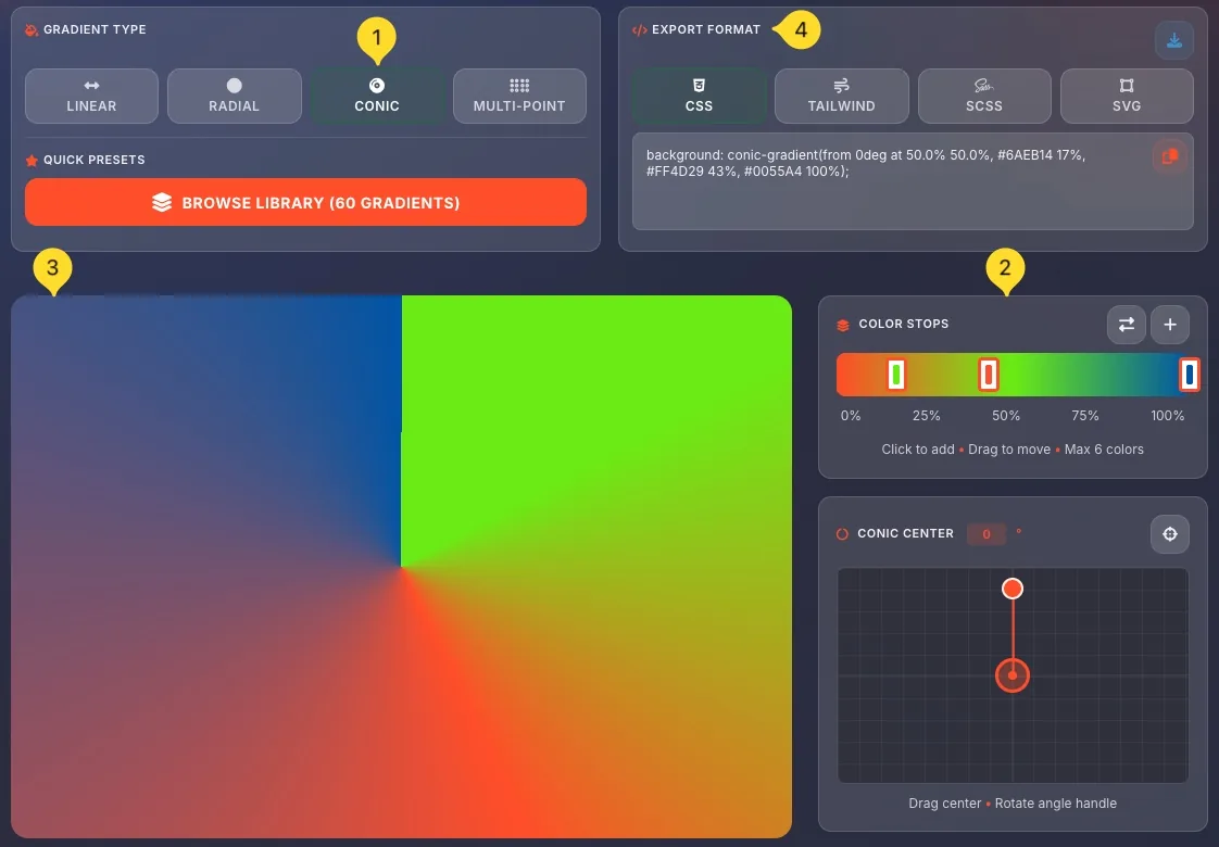
CONIC gradient
Creates a sweep gradient (like a pie chart). Two panels:
COLOR STOPS:
• Horizontal bar with draggable stops
CONIC CENTER:
• Grid with draggable center point
• Angle input (0°) - Starting angle
• Rotation handle to set starting direction
Drag center to position, rotate handle for angle.
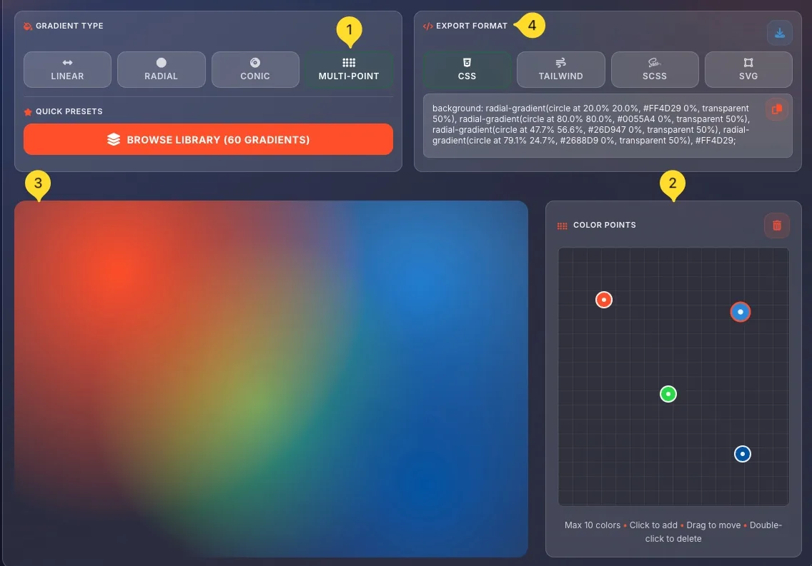
MULTI-POINT gradient
Creates multiple overlapping radial gradients for complex effects. COLOR POINTS panel shows:
• 2D grid for placing color points
• Click anywhere to add a point (max 10)
• Drag points to reposition
• Double-click to delete
• Clear button to remove all
Each point creates a radial gradient that blends with others.
/* Linear */
background: linear-gradient(0deg, #FF4D29 0%, #0055A4 100%);

/* Radial */
background: radial-gradient(circle at 50% 50%, #FF4D29 0%, #0055A4 100%);

/* Conic */
background: conic-gradient(from 0deg at 50% 50%, #FF4D29 0%, #0055A4 100%);

/* Multi-point */
background: radial-gradient(circle at 20% 20%, #FF4D29 0%, transparent 50%),
            radial-gradient(circle at 80% 80%, #0055A4 0%, transparent 50%);
Contrast checker mode WCAG AA/AAA
Contrast checker mode verifies that your text and background color combinations meet accessibility standards. It includes colorblind simulation and automatic fix suggestions.
Select Contrast checker mode
Click the Contrast checker button (fifth mode). It has an accessibility icon and description WCAG AA/AAA. The interface shows color inputs, preview, contrast ratio, and compliance indicators.
COLORS panel
Set your two colors:
• TEXT: Click the color swatch to pick your text/foreground color
• BACKGROUND: Click to pick your background color
HEX codes display below each swatch with copy buttons.
Click the star to save this combination as a preset.
TEXT SIZE slider
Drag the TEXT SIZE slider to set the font size (in pixels). The sample preview updates to match. WCAG has different requirements for normal text (below 18pt) vs large text (18pt+ or 14pt bold).
COLORBLIND SIMULATION
Test how your colors appear to people with color vision deficiency:
• Normal: Standard vision
• Protanopia: Red-blind (1% of males)
• Deuteranopia: Green-blind (6% of males)
• Tritanopia: Blue-blind (rare)
Click any button to see your colors through that filter.
Sample preview
The large sample preview panel shows your text on your background at the selected size:
• Large heading ("Sample heading")
• Body paragraph text
• Small text example
This is exactly how your text would appear in real use.
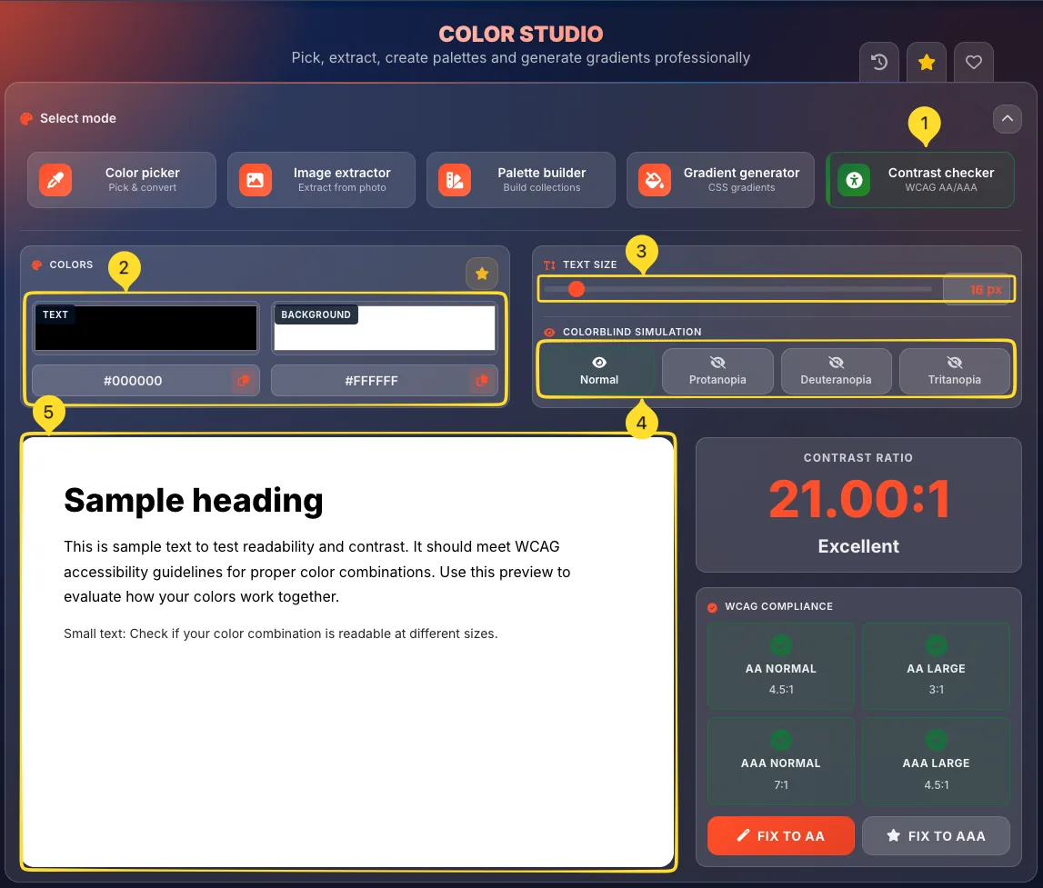
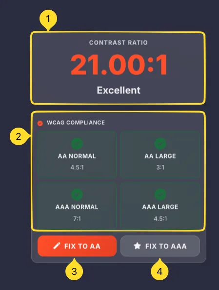
WCAG COMPLIANCE Accessibility
The WCAG COMPLIANCE panel shows whether your color combination meets Web Content Accessibility Guidelines, with automatic fix suggestions.
CONTRAST RATIO display
A large number shows the calculated contrast ratio (e.g., 21.00:1). Higher ratios mean more contrast. Below it, a label indicates quality:
• Excellent: Very high contrast
• Good: Adequate for most uses
• Poor: May cause readability issues
• Fail: Does not meet minimum standards
Compliance indicators
Four boxes show WCAG compliance:
• AA NORMAL (4.5:1) - Standard text minimum
• AA LARGE (3:1) - Large text minimum
• AAA NORMAL (7:1) - Enhanced standard text
• AAA LARGE (4.5:1) - Enhanced large text
Green checkmarks indicate pass, red X indicates fail.
Understanding the levels
WCAG AA is the minimum legal requirement in many countries. Requires 4.5:1 for normal text, 3:1 for large text.
WCAG AAA is the enhanced level for best accessibility. Requires 7:1 for normal text, 4.5:1 for large text.
Large text is defined as 18pt (24px) or 14pt bold (18.5px bold).
FIX TO AA button
Click FIX TO AA (orange button) to automatically adjust your colors to meet AA requirements. The tool adjusts the minimum amount needed, preserving your color scheme as much as possible.
FIX TO AAA button
Click FIX TO AAA (gray button with star) to automatically adjust for enhanced AAA compliance. This creates maximum accessibility but may change colors more significantly.
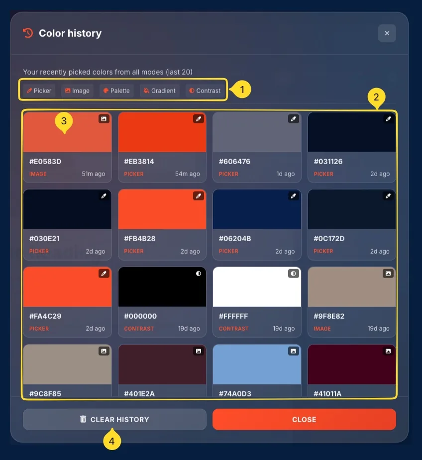
Color history modal Recent colors
The Color history modal shows your recently picked colors from all modes, making it easy to reuse colors without remembering codes.
Open Color history
Click the History button in the header. The modal opens showing: "Your recently picked colors from all modes (last 20)".
Filter tabs
Filter by source mode:
• Picker: Colors from Color picker
• Image: Colors from Image extractor
• Palette: Colors from Palette builder
• Gradient: Colors from Gradient generator
• Contrast: Colors from Contrast checker
Click a tab to show only colors from that mode.
Color grid
Colors display in a grid. Each swatch shows:
• Color preview with source icon
• HEX code (e.g., #9F8E82)
• Source label (IMAGE, CONTRAST, PICKER, etc.)
• Time ago (17d ago, 22d ago, etc.)
Use a color
Click any color swatch to apply it in the current mode. The modal closes and the color is loaded into the active tool.
CLEAR HISTORY button
Click CLEAR HISTORY to delete all saved colors. Click CLOSE to dismiss the modal without changes.
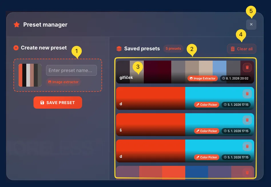
Preset manager modal Save & organize
The Preset manager lets you save color combinations and palettes for reuse. Create named presets from any mode and access them anytime.
Open Preset manager
Click the Presets button in the header, or click any Save preset button in individual modes. The modal shows two sections: Create new preset and Saved presets.

Create new preset
The left panel shows your current colors:
• Palette preview (dashed border)
• Enter preset name... input field
• Source badge (e.g., "Image extractor")
• SAVE PRESET button
Type a name and click SAVE PRESET to create.
Saved presets list
The right panel shows Saved presets with a count badge (e.g., "5 presets"). Each preset displays:
• Horizontal color bars preview
• Preset name (e.g., "gifíček")
• Source badge (Image Extractor, Color Picker, etc.)
• Timestamp (e.g., "8. 1. 2026 20:02")
• Delete button
Apply a preset
Click any preset in the list to apply its colors to the current mode. The modal closes and colors load into your workspace.
Clear all button
Click Clear all (red button in header) to delete all saved presets. Use with caution - this cannot be undone.
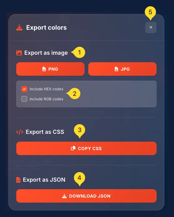
Export colors modal Multiple formats
The Export colors modal lets you save your palette in multiple formats for different use cases.
Open Export modal
Click the Download button in any mode (Image extractor, Palette builder, etc.). The Export colors modal opens with three export sections.

Export as image
Download your palette as an image:
• PNG button - Lossless, transparent support
• JPG button - Smaller file size
Checkboxes below control what to include:
• Include HEX codes: Add color codes to image
• Include RGB codes: Add RGB values too
Export as CSS
Click COPY CSS to copy CSS custom properties (variables) for your palette — for example::root { --color-1: #DC7C6D; --color-2: #152442; --color-3: #4A5067; }
Paste directly into your stylesheet.
Export as JSON
Click DOWNLOAD JSON to save a JSON file with all color data. Includes all formats (HEX, RGB, HSL, etc.) for each color. Useful for programmatic access or sharing with developers.